Feb 2021 - Jul 2021

Overview
It's essential to explore optimal LTV on UID level for TikTok users. To optimize cross-end user experience, we need adapt product framework in different ends, as well as define the key issue of "cross-end experience"
Role
Lead Product Designer
Skills
UX design / Visual design
PLATFORM
Tablet

10 Design Patent
Video related interactive patent
Apr 2021

Featured on Apple Events
What you can do with your iPad
Set 2021

BACKGROUND
Design for iPad
In recent years, the iPad has undergone a significant transformation. From being a large touch screen device, it has evolved to support multiple inputs and adapt to diverse situations. This evolution has revolutionized how users engage with their applications.
An exceptional iPad app experience goes beyond an adaptive interface that adjusts to various window sizes. It encompasses technologies such as multi-window functionality, drag and drop capabilities, and support for diverse input modes available on the iPad.
ALL DEVICE DAU
433 million
IOS DAU
140 million
iPad DAU
7 million
DESIGN RULES
Designing a great iPad app experience involves 4 parts
Dynamic layout system optimized for touch interactions on displays ≥ 10 inches
Support for multiple input methods like the Keyboard, Trackpad and Apple Pencil.
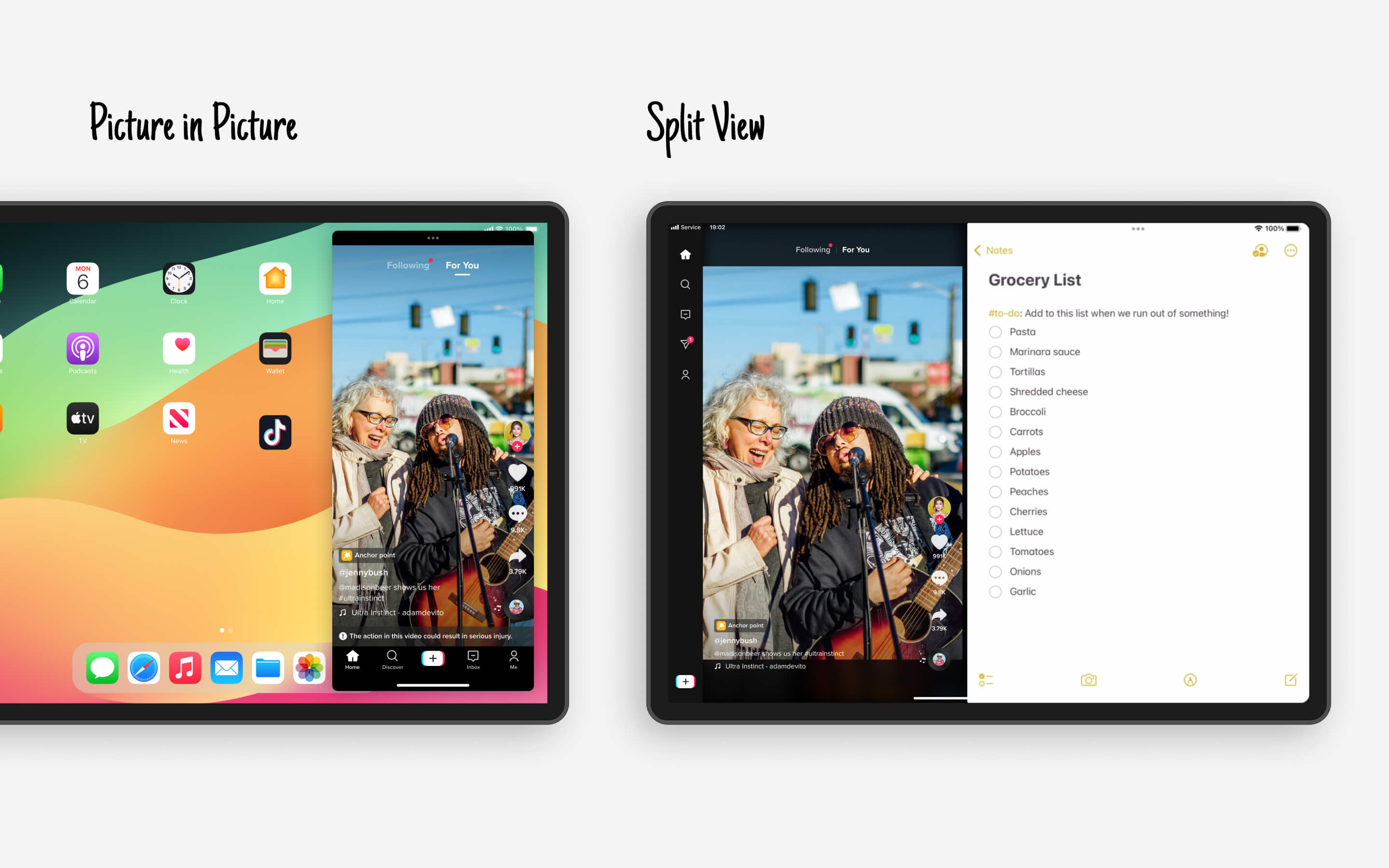
iPadOS provides system-level technologies like Multi-Touch gestures and Drag and Drop APIs, which enable interface patterns such as Split View and Stage Manager, along with system services like Picture in Picture.
Use toolbars to position buttons and actions.

Dynamic layout
01 · Flatten the navigation
The first step is to take the advantage of the display, to show the content and user interface in the best possible light. Instead of empty space, it fills the display with the content like notifications, messages, comments.

Larger video aspect ratio
Bottom nav to the left side. Approximately 90% of iPad users also utilize mobile devices. They are well-versed in the functionality of bottom tab icons. By relocating the bottom tab to the left side of the screen, we've optimized space utilization for greater efficiency. The iPad layout serves as a foundational blueprint for potential TikTok Mac OS versions in the future.
Multitasking is the cornerstone of TikTok's iPad design. It enables users to watch videos, read comments, and make comments simultaneously.

Dynamic layout
02 · Show more content
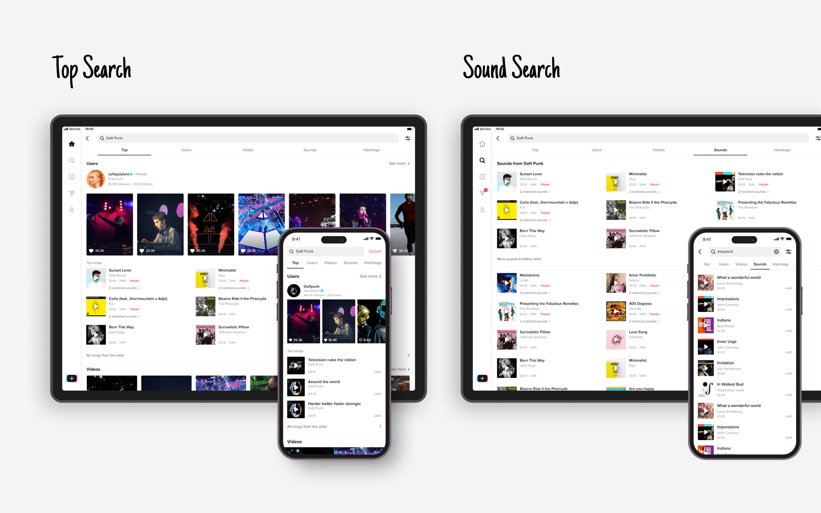
iPad can take up 300% capacity to presenting a lot more contents, use the grid system to show more content. In iPad, we user 3 column grid, the video cover and sounds track are still plenty big enough to see, read and tap on.

Dynamic layout
03 · Stay in context
In TikTok, there's an increasing trend of segmented videos, where users divide a long video into several short ones. Tapping 'profile' will redirects to new page on mobile. However, on the iPad, we enable users to watch videos and browse profiles in the same time.
Dynamic layout
04 · Create immersive experience
The customized immersive layout is specific for iPad design, the icons are in the outside of the content which make the video is more clean. The entire device becoming a piece of content.
Gesture specific for iPad, The icons are placed in the both side of the screen when you Shooting a video. it’s easy to use with 2 hands when holding an iPad.

Multi-tesk
05 · Multi Window, split view and picture in picture
From iPad, many people tend to multitask while watching videos, such as writing documents, drawing, or even cooking… Users can watch TikTok while doing other tasks, and the video will automatically switch to the next in split view.

Mac OS & TikTok TV to be continue…
TONY
TONY