Overview
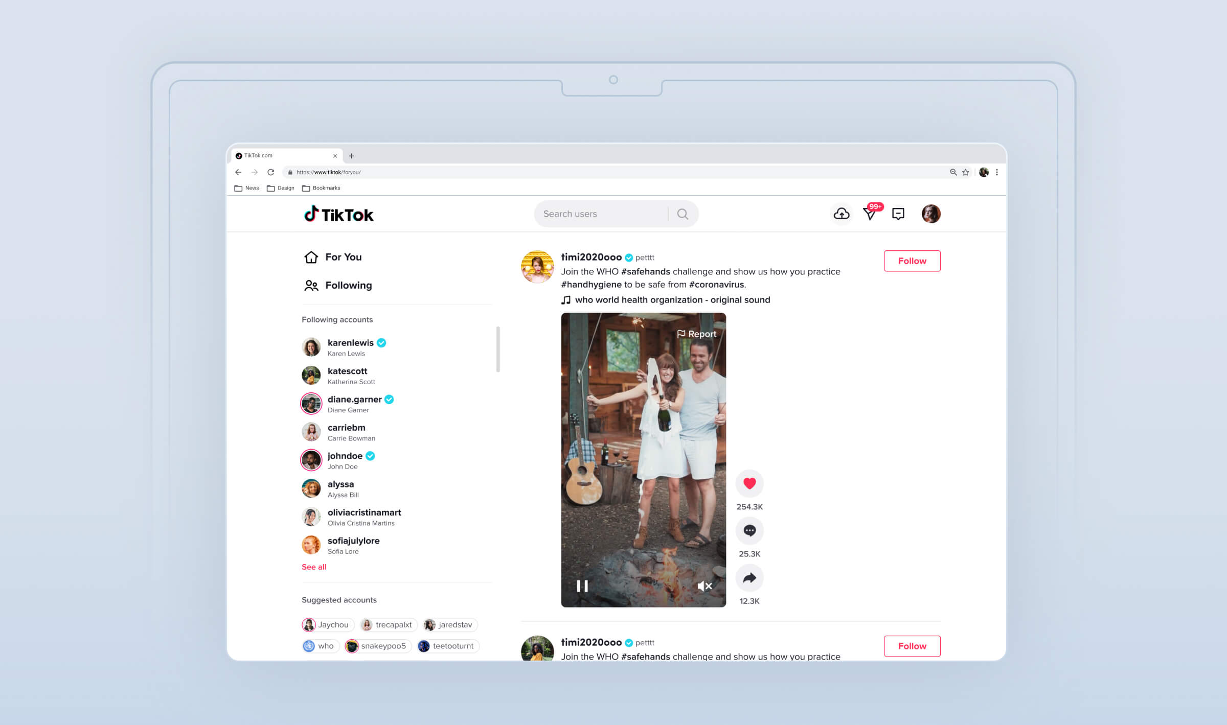
The WebApp's DAU is around 10 million compared to our app's 500 million DAU, marking a 1:50 ratio. However, in comparison to platforms like Facebook, Instagram, etc., their WebApp users already account for up to 30% of their mobile users. This highlights the substantial potential of TikTok's WebApp.
Role
Lead Product Designer
Skills
UX design / Visual design / Motion
PLATFORM
WebApp
CONTEXT
Why we need restructure the TikTok WebApp?
Serve non-app users
Including mobile web and desktop visitors: we've only been serving our native app users so far, but other products (e.g. Facebook, Instagram, Pinterest, Youtube) find there are 30% of native App traffic also coming from mobile web and desktop.
Improve brand image
Expose the TikTok community and contents to the world via the web could raise the brand awareness; by providing a full product experience and more content to prospective users via web, we can drive improvement in our brand and increase the conversion
Indexable content for SEO
Proper Progressive WebApps are indexable and have strong technical SEO profiles that can help TikTok gain more exposure on the web and drive organic visitors

We use the WebApp as a tool for referrals and improving organic search, directing users to download the native TikTok app, while also help to better serve users who consume videos on the WebApp.
PROBLEMS
Commonness and Differences
Our users' initial impression of TikTok is as a short video platform, which is indeed true. However, this represents just the early stage when compared to DouYin (the Chinese TikTok). In the future, TikTok definitely doesn't want to just build a video platform as a pure entertainment app. We aim to have over 40%+ of landscape videos as long videos which is more educational on TikTok. The next step involves serving those creators and enhancing the consumption experience.
TikTok possesses extensive textual and video resources. Better utilization of these resources can help in promoting SEO profiles and enhancing TikTok traffic.
It's challenging for users to engage with short videos for an extended period on the web.
Satisfying user needs involves balancing the relationship between short and long videos across various scenarios. Users tend to naturally watch long videos on larger screens, as it reduces physical interaction between the user and the device.
Goal
Job to be done
Todo 1
Discoverable Index
Improve SEO
Identifiable as “applications” allowing search engines to find them
Todo 2
Level up Acquisition
Overall Experience
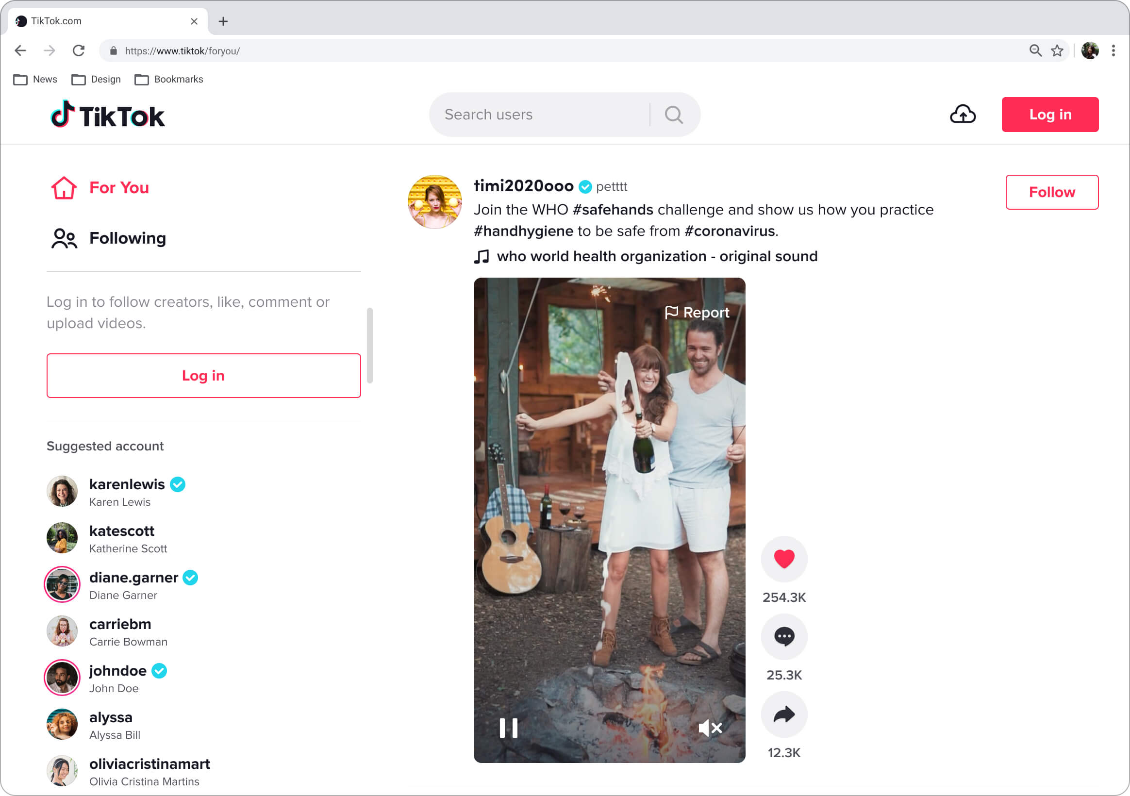
Better promote and guide user login and sign up to TikTok
Todo 3
Immersive Experience
Browser mode & Responsive
Improve the consuming experience in WebApp but not like a version of native
success metric
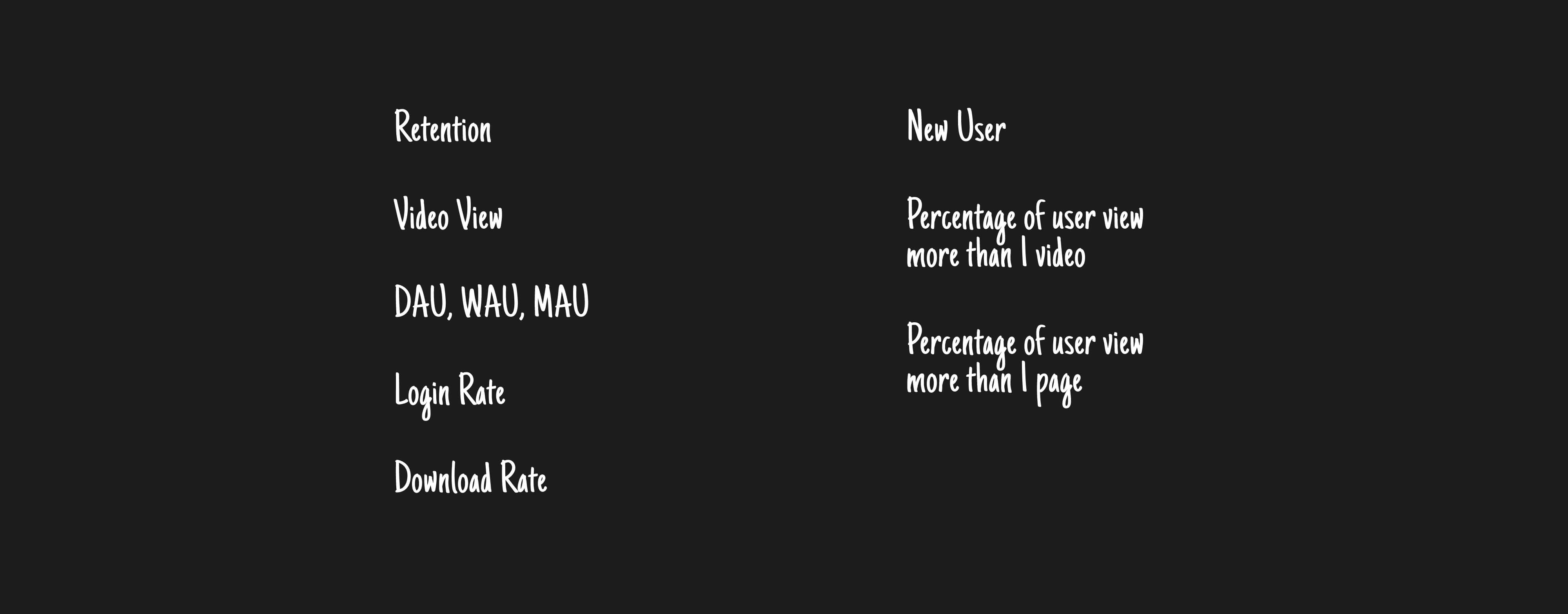
How to measure success?
DESIGN process
Redesign the TikTok Structure
Competitor Research
We stand apart from subscription video services, traditional long video sites, and typical social media platforms. However, we've gained insights from various product structures. We've assembled a comprehensive list of their strengths and weaknesses to evaluate their applicability within the TikTok WebApp.
Improve SEO in TT WebApp
Todo 1
Discoverable
Improve SEO
Identifiable as “applications” allowing search engines to find them
Video Share & Embed
Embedded Videos enable TikTok videos to be embedded into any articles or websites. This helps to foster storytelling, and provides proper attribution by showing the video creator, video description and background sound in the form of TikTok's custom player. It also links back to the corresponding content on TikTok. Its improve the acquisition and SEO
Embed video has huge exposure outside of the TikTok WebApp (daily average PV 14.46M, UV8.30M), but the conversion rate CTR is low, The DAU of Embed contribute to the WebApp is low.
WebApp DNU are slowdown and it needs a new way to get acquisition.

I noticed that related videos after the video playback ends, there's high click rate but very low sharing and commenting actions. I hypothesize that users will do actions after watching the video. Therefore, we've enhanced the post-video interactions.

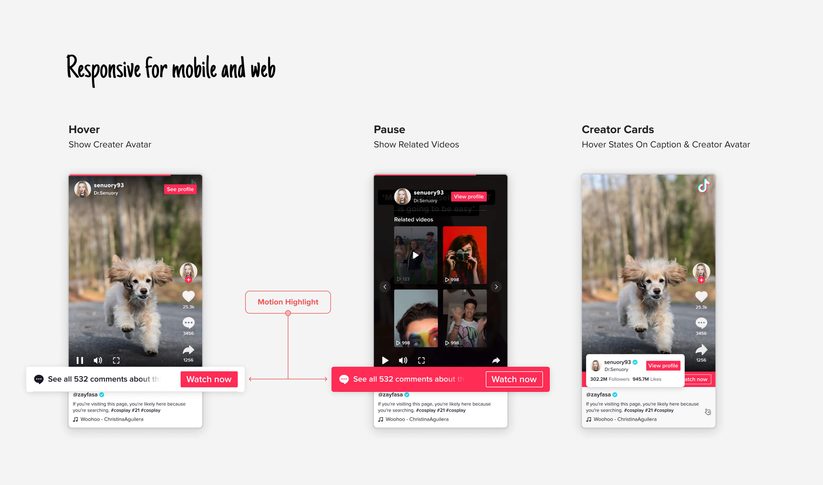
AB test on pause screen, play button as previous design or show video covers.
AB test on video finished screen, 1 cover, 4 covers, 3 covers without action button.
Multiple AB tests were conducted to modify banner content and determine the quantity of associated video thumbnails, resulting in the final layout.

Click on Video cover
+82%
Redirect to webapp
+3.41%
Click red button
+3.2%
Overall Experience
Improve users sign up flow and consuming experience
Todo 2
Level up Acquisition
Overall Experience
Better promote and guide user login and sign up to TikTok
Browser mode for SEO
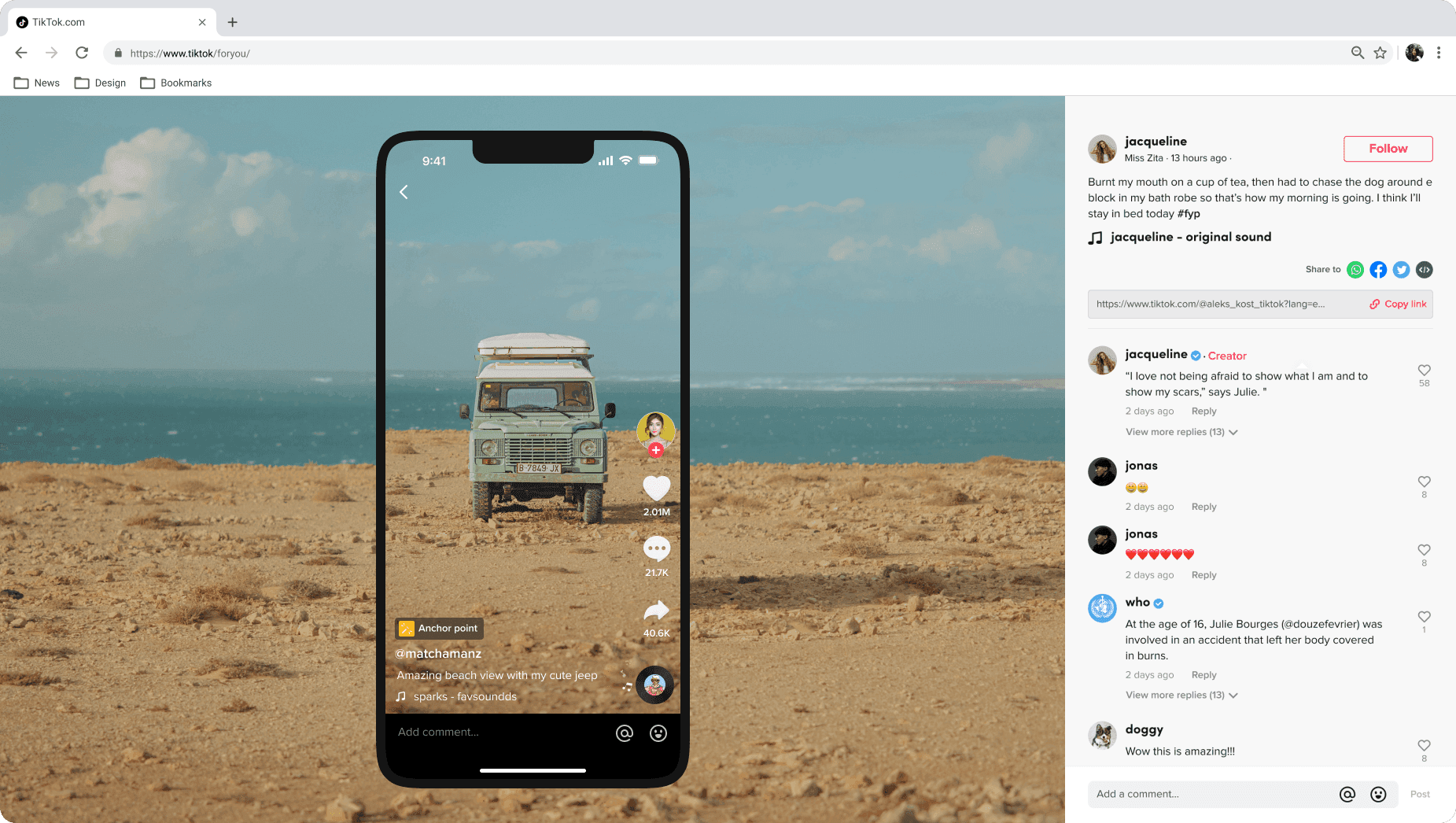
Browser mode are helping SEO dramatically. It provide share and embed ability, the video has it own URL, the video content and video comments are bring a lot of organic traffic to the website.
Immersive experience
User get into a larger player with the comments displayed on the right side of the screen. User can add comment, like, follow and navigate to the next video in your feed as well. It’s a more immersive way to consume TikTok content for sure.
The player for short video
Autoplay reduce the interaction between the user and the device. A square player maintains consistent experiences for both landscape and portrait videos.
Problems & Business Goal
Low Sign up & Sign in rate
Users leave the page after consuming or commenting on videos. Users can comment on and watch videos in browser mode at no cost which
Users cannot consume videos when multitasking.
Users enjoy viewing videos while concurrently handling different tasks in browser mode, but they have to switch to next video manually.
In Browser mode, users can focus more on the video itself rather than numerous entries and content. However, providing users with excessive freedom has resulted in low sign-up and engagement rates in browser mode.
In the next iteration, we will require users to sign up before making comments.


In browser mode, users can set the next video to autoplay or switch videos by clicking button. Short videos can be viewed similarly as long video without the need for frequent interactions.
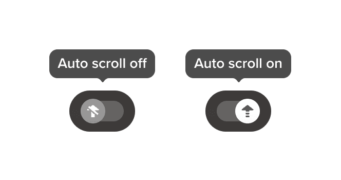
The login prompt will appear when the video finishes and will cycle through every 5 videos.
Result
Sign Up
+8.2%
View Duration
+38.2%
Video view over 1+ video
+47.8%
Responsive video player and page
Todo 3
Immersive Experience
Responsive Video
Improve the consuming experience in WebApp but not like a version of native
The bounce rate was excessively high when user entry into the WebApp at first time. We attempted various measures to reduce this rate but discovered that the WebApp only displayed one video within the viewport on 13-15 inch devices. As a result, we needed to adapt the video player to different viewports.
ACTIONS
Responsive both video and page
We setting up 5 different breaking point allow user to have same experience on different device. The video within the current viewport will always be maximized in size. Additionally, ensure that the current viewport consistently displays the next video.

The action button located outside the video has much higher click penetration, so we've maintained that layout in the WebApp.
TikTok contains both landscape and portrait videos, put the video within square player ensures a uniform viewing experience across all videos.
Multitasking on PC WebApp
Users can engage in multitasking on the PC while simultaneously watching TikTok videos, effectively utilizing the desktop space. Additionally, the feed page displays all entry points for convenience.


TONY
TONY
