Apr 2024 - Oct 2024

Overview
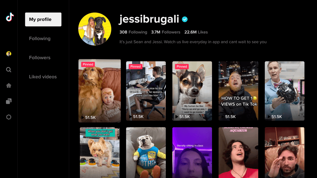
We are optimizing the 'My Profile' and 'Other's Profile' features to deliver enhanced value to TikTok TV users. The updated profiles will allow users to effortlessly access their curated content assets and quickly build relationships through other creators' profiles.
Role
Lead Product Designer
Skills
UX design / Visual design
PLATFORM
TV

1 Design Patent
Video related interactive patent
Design inventions
Apr 2024 - Oct 2024
Problems
What's the difference?
The initial profile pages were built in 2020. It's an MVP version for users to view the creator's details.
We found out that Interactions vary between 'My Profile' and 'Others Profile': Focus on Liked and Favorited video consumption in 'My profile', with no social features. In 'Others Profiles', prioritize social attributes, placing user info at the top visual area.
My Profile

Others Profile
the fact
On TV, around 20% of logged-in users access their profile daily, averaging 2.6 visits per day. Among them, 73% consume videos from "My Videos" and "Liked Videos," while 32% visit other profiles via "Following" and "Followers."
My profile as the place for logged-in users to consume videos shouldn't have the same structure as other's profile
Possibility
Wireframing
Hover to play
Left-right & Waterfall
✅ Show 8 videos
✅ Easy to follow the creators
✅ Intentionally feeling of searching consuming
❎ Return to the Nav will take two steps
❎ Focus position is not stable
Hover to play
Left-right & Rows
❎ Show 4.5 videos
❎ Hard to follow if the users browse too many videos
✅ Return to the Nav can be only one step
❎ Other rows may disturb the user
❎ If users enter other's profiles and focus on a history video, returning to the front of the row is hard.
Hover to play
Up-down & Waterfall
❎ Show 5 videos
❎ Waste too much white space
✅ Intentionally feeling of searching not consuming
✅ Always show the creator's info and follow the button
❎ Hard to follow if the users browse too many videos
Hover to play
Up-down & Rows
❎ Show 5.5 videos
❎ Waste too much white space
✅ Return to the Nav can be only one step
❎ If users enter other's profiles and focus on a history video, returning to the front of the row is hard.
Conclusion

Waterfall Format
The waterfall format allows users to search certain content, but the rows format will enable users to consume content continuously. In the case of the profile page, the waterfall format is the best solution.

Left & Right
To improve the capacity of the screen but not too overwhelming, we are using left & right structures for both my profile & other's profiles. The right side of the content area can show 8-12 videos at a maximum.
NEW experience
Differentiated profile
Our practice
In ‘my profile’, users are already somewhat familiar with the content they have previously viewed. In this scenario, they are more concerned with searching for videos rather than consuming them.
My profile
To allow users to access their collected videos more quickly, the user bio is no longer emphasized on TV. Instead, navigation is prioritized to help users find the right content.
Others profile
Keep the social genes as the core content on other's profiles. Users can press ‘left’ for at most 5 steps to follow the creators no matter how many videos they browsed.
Prototype
Inner flow
My profile
Others profile
The Result
To be continued…
Features


TONY
TONY