Apr 2024 - Oct 2024

Overview
TikTok is a fast growing product, and we start to realize that TikTok TV can showcase a wider variety of content that may be better suited for a TV viewing experience, such as longer videos, or series and subscription based videos.
Role
Lead Product Designer
Skills
UX design / Visual design
PLATFORM
TV

6 Design Patent
Video related interactive patent
Design inventions
Apr 2024 - Oct 2024

Special thanks
Nina Ding
Zhanchen Zhang
Weilong Gao
BACKGROUND
Why TV?
Since its successful launch in the North American market in November 2021, TikTok TV has successively landed on Android and webOS platforms. We have continuously optimized the product during this period and accumulated valuable market experience.
By the second half of 2023, as the TV business gradually became one of the core segments of PGC, we began significantly increasing our investment in this field.
ALL DEVICE DAU
1.9 million
Android TV
70%
Web TV
30%
THE NEW VISUAL
A vast window of TV
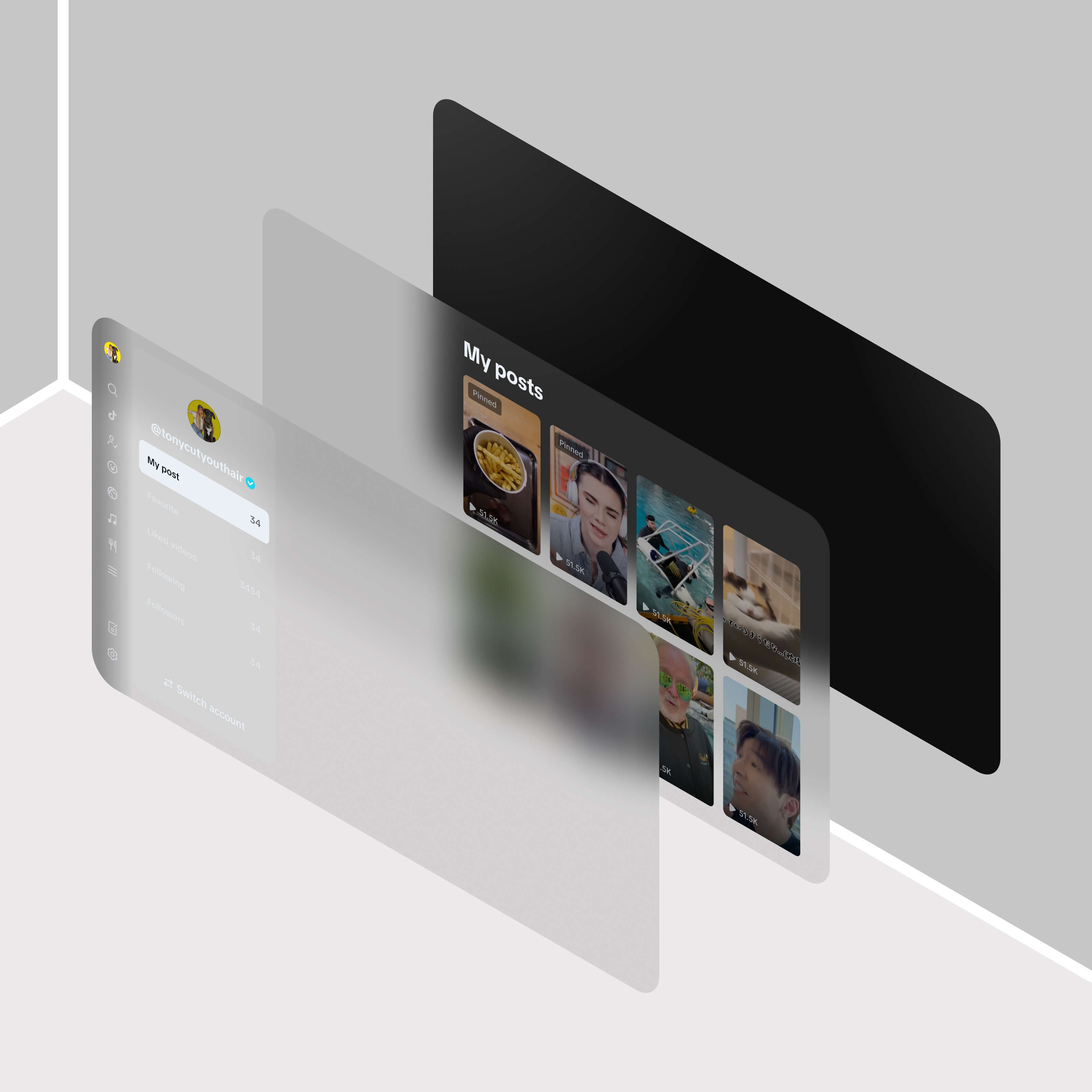
We hope that TikTok TV can become a vast window, transforming the TV interface into a spatial medium that connects users' rooms with the television screen.
We want to create a spatial feeling in the TV interface. Regarding spatial sense, the goal is to create an experience that allows users to perceive this sensation across different layers in the TV platform.
Due to constraints on the TV platform, applying a blur effect, motion with color, and transitional motion on Web TV and Android TV can cause significant performance issues.
Therefore, we have adopted the plan to enhance the spatial feeling and applied transparent color on various layers. This approach allows different spotlight backgrounds to pass through these transparent layers, creating a sense of depth and spatiality.


THE NEW IDENTITY
Interactions & Animation
Animation plays a crucial role in TV product design, influencing everything from user engagement to brand identity. Animation provides immediate feedback and guides the user’s attention.
Compared to previous TV designs, we have a tendency to incorporate more interactive motions into our current design approach. We have applied several motion principles to the project to enhance the user experience.
Dynamic background & video consumption
As the most important element on TikTok TV video feeds. Users spend nearly 90% of their time on the feed and engaging in video interactions. We have introduced an immersive background based on the current video to improve the spatial watching experience.
Feeling of In & out
To create an immersive TV consumption experience, we have added smoother animation when entering and exiting pages, allowing users to perceive the spatial relationships between pages.
Scaling the interface by 30% from top to bottom can make the transition more noticeable without being overly dramatic on the TV screen.
Cold start loading
Due to the product's modality, TikTok TV requires additional time to preload FYF videos during the cold start phase. To address this, we have implemented two animations that serve to extend the cold start period across various TV devices.
We have observed that users enter the feed before the interface has fully loaded, and they tend to lose patience after a prolonged wait.
Loop loading should commence once the TikTok logo is hidden. It is essential to ensure that all content and components are fully prepared prior to the conclusion of the cold start video playback.

THE NEW LOOKS
Components & Focus
Components
We apply the new TV visual system while maintaining consistency with TikTok’s design system in component proportions, corners, and gradients.
To align with the TV interface's spatial design, we extensively use transparent colors across components for a unified look.
Focus
Compared with touch-based interfaces, television interfaces emphasize utilizing various primary states (such as default, focused, and pressed) to capture the user's attention on the selected element. This approach forms the foundation for initiating navigation.
Horizontal Focus: The static position of focus states will consistently highlight the Second Item in the horizontal row, ensuring a fixed point of interest along the horizontal axis.
Vertical Focus: The static position of focus states will consistently be Centered on the list, ensuring that the focal point remains in the middle of the vertical layout.
Features
TONY
TONY


